Choosing the right typeface for your company logo is not just about branding, it’s also about choosing a font that communicates the right message to the general public.
 Many successful and popular products are almost synonymous with a certain kind of font. Think about Coca-Cola’s curved font or IBM’s clear-cut letters. Those fonts have become visually ingrained in people’s conception of the brand.
If you are working on getting your website done, you should avoid fonts that are too cute, old-fashioned, or even bold. You will want to use fonts that are sleek, modern, and professional.
Here are some best practices of using fonts to your craft business:
Logos
Selecting the right font when working on a logo design is important because your logo is your brand, and so is your font choice. Your font should have character, be stylish, and portray your image or expression properly. So what does this mean?
When speaking about business logos, we usually mean logos that are easy to read, clean, and not too fancy. So what kind of fonts should we be using? What kind of typeface will make my logo look best?
Think about successful brands when considering what typography you’re looking to incorporate into your craft business logo. Font is essential when designing a logo. Think about it: you can pick out a specific font and know exactly what the brand is. Disney is an excellent example of this. People from all over the world can identify the brand just by the unique swirls of the letters.
Letters And Emails
If you are designing a logo or other material for your business, you need to consider the importance of factors such as colors, space, shapes, and design.
With the hundreds of computer fonts available, only a few are considered appropriate for business letters. Because the purpose of a business letter isn’t to showcase your artistic skills, a standard non-decorative font is best-suited for your audience.When you are writing letters, it’s important to select a font that is clear and easy to read.
In addition, the font size is just as important as the font style. If you opt for a font that’s too small, the recipient of your business letter might not be able to read the words clearly without magnification. On the other hand, a large font tends to look overstated, juvenile, and unprofessional. The University of California Career Development Center recommends a font size between 10 and 12 points to ensure legibility and readability.
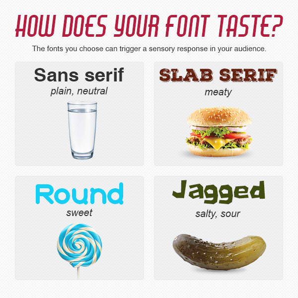
Today, the internet offers a wide array of fonts to use in logos and other promotional materials. But first, get to know how your logo font appeals to your audiences:

A similar effect can apply to your target audience’s other senses. So keep this in mind if you want to catch your reader’s attention.
Remember, a font is like clothing: it’s used to portray stature, style, mood, your professionalism, your anti-professionalism, and more!
With so much information out there, users tend to look (or click) away from text that is not easy to understand in a flash. Those are readers, or potential customers, that you may never get back.
- DIY Chicken Wire Jewelry Holder - June 27, 2022
- Jewelry Designer Manager Alternative - December 8, 2019
- 3 Tips To Immediately Boost Your Sales Today - May 12, 2019

